Posted in Tutorials | Beginners | Tutorials
Rounded tabs with dijit Theming
Everybody likes rounded buttons, rounded page elements and last but not least, rounded tabs. Fortunately dijit comes with great theming possibilities, so I will show you how you can make your own fancy rounded tabs using a simple image sprite and a couple of CSS classes.
Now we have to consider a couple of things before we get started. These are issues you might not think of in the first place, but down the line it is important to keep them in mind.
- Our tabs need to be width independent. We don’t know how long the containing text will be
- Our tabs need to be height independent. Always keep user accessibility in mind. Some people don’t see as well as you do and they will want to look at your site in a different scale.
Following these two points will create a few visual drawbacks which we’ll see later in this tutorial. Of course you could say “Ohh, I don’t care about these things”—especially point #2—but keep in mind that you might lose a certain kind of audience.
Enough talking, let’s get started and make a fancy tab design in your favorite imaging software, and don’t forget the rounded corners!
The graphics
Looking at the above Design we can agree on the fact that the left and right corners should be separate images. We can make a centered image and repeat it on the x-axis to fill potentially large widths.
 VS.
VS. 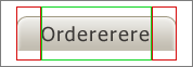
All we need is a simple image sprite and we’re ready to write our own CSS rules.
You might realize that the following sprite contains 9 images, and you might have expected 6. Well, since dijit supports a hover state for tabs I decided to implement a hover state as well. In the end of the tutorial I will explain what you need to do to get rid of the hover state if you don’t want it.
So, the sprite contains nine images:
- Active Tab - Left (no repeat)
- Active Tab - Center (this one repeats itself on the x-axis)
- Active Tab - Right (no repeat)
- Hover Tab - Left (no repeat)
- Hover Tab - Center (this one repeats itself on the x-axis)
- Hover Tab - Right (no repeat)
- Inactive Tab - Left (no repeat)
- Inactive Tab - Center (this one repeats itself on the x-axis)
- Inactive Tab - Right (no repeat)
This is all we need to get started with writing our rounded tabs CSS rules.
The CSS
Lets take a look at the tab template in dijit/layout/templates/_tabButton.html (Sorry for the bad formatting.. the plugin doesn’t like this piece of html  )
)
<div waiRole="presentation" dojoAttachEvent='onclick:onClick,onmouseenter:_onMouse,onmouseleave:_onMouse'>
    <div waiRole="presentation" class='dijitTabInnerDiv' dojoAttachPoint='innerDiv'>
        <div waiRole="presentation" class='dijitTabContent' dojoAttachPoint='tabContent'>
            <span dojoAttachPoint='containerNode,focusNode'>${!label}</span>
            <span dojoAttachPoint='closeButtonNode' class='closeImage' dojoAttachEvent='onmouseenter:_onMouse, onmouseleave:_onMouse, onclick:onClickCloseButton' stateModifier='CloseButton'>
            <span dojoAttachPoint='closeText' class='closeText'>x</span>
            </span>
        </div>
    </div>
</div>
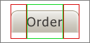
We can see that there are two useful classes: dijitTabInnerDiv and dijitTabContent. You might realize that we need three classes to successfully do our job. You are right, and luckily dijit inserts one more class when creating the tabs called dijitTab. Now with these three available classes in place we need to agree on which image gets to be used for which class.
First of all, and most easily, the class .dijitTabContent will have to use the center x-repeating image. dijitTabContent contains the content of the tab and stretches with its width.
The rest is easy: .dijitTab uses the left image and .dijitTabInnerDiv the right image. Let’s get started.
Let’s take a look at a Dojo Toolkit default styling for tabs:
Please confirm your order
Please order your food
Please order your drinks
And now let’s modify the corresponding CSS:
.dijitTab {
	background: url("images/tabcontainersprite.gif") no-repeat 0 -300px;
	padding:0px;
	margin-bottom: 1px;
	border: none;
	font-family: Tahoma, Arial;
	font-size: 18px;
	color: #a9a098;
}

.dijitTabContent {
    background: url("images/tabcontainersprite.gif") repeat-x 0 -350px;
	padding:5px 10px 5px 10px;
	border: none;
}

.dijitTabInnerDiv {
    background: url("images/tabcontainersprite.gif") no-repeat right -400px;
	padding:0px 10px 0px 10px;
	border: none;
}
And it will look like:
Please confirm your order
Please order your food
Please order your drinks
That is already pretty close isn’t it?
Now we need to create the right CSS classes for the non-active and hover tabs. Dijit tabs support two additional CSS classes called .dijitTabChecked (for the current active tab) and .dijitTabHover (for the hovered tab). Let’s add them to the same CSS file.
.dijitTabHover {
	background: url("images/tabcontainersprite.gif") no-repeat 0px -150px;
}

.dijitTabHover .dijitTabInnerDiv {
	background: url("images/tabcontainersprite.gif") no-repeat right -250px;
	border: none;
}

.dijitTabHover .dijitTabInnerDiv .dijitTabContent {
	background: url("images/tabcontainersprite.gif") repeat-x 0 -200px;
	padding:5px 10px 5px 10px;
}

.dijitTabChecked {
	/* the selected tab (with or without hover) */
	background: url("images/tabcontainersprite.gif") no-repeat 0px -0px;
	margin-bottom: 0px;
	color: #3b3836;
}

.dijitTabChecked .dijitTabInnerDiv {
	padding:0px 10px 0px 10px;
	background: url("images/tabcontainersprite.gif") no-repeat right -100px;
	border: none;
}

.dijitTabChecked .dijitTabInnerDiv .dijitTabContent {
	background: url("images/tabcontainersprite.gif") repeat-x 0 -50px;
	padding:5px 10px 6px 10px;
}
And we’ll get:
Please confirm your order
Please order your food
Please order your drinks
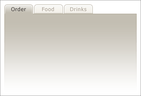
Of course we are still missing the fading background. To change a tabcontainers background we simply have to change the .dijitTabPaneWrapper class and add the correct background image.
.dijitTabPaneWrapper { /* Container for tab content */
	/*
	overflow: hidden;
	*/
	background: url("images/tabbg.gif") no-repeat;
	width: 452px;
	height: 267px;
	border: 0;
	padding: 10px;
}
And we’re done! We have fancy rounded tabs and they work.
Please confirm your order
Please order your food
Please order your drinks
As I promised earlier I also will show how to have tabs without the hover state. It is simple: just delete all classes containing .dijitTabHover and you’re all set.
Please confirm your order
Please order your food
Please order your drinks
Some notes
What does the padding do in all the .dijitTabContent classes?
The padding is the “tricky” business of creating the correct layout for the tabs. Just try playing around with its values and you will see what it does.
Tip: since the margin-bottom of the active tabs is different than the one of the inactive tabs, the top or bottom padding has to be different as well.
Why do we have margin-bottom: 1px in the inactive tabs and margin-bottom: 0px in the active tabs?
When you take a closer look you will see that the active tabs don’t have a border on the bottom side. The only way to achieve this is by laying the tab itself over the tab container (the part where we have all the content). To really understand what is happening I also suggest that you just play with the values and see what happens.
How about bottom and left/right tabs?
Well, I think I’d better leave this challenge to you for now. Fortunately the nihilo and soria theme of the Dojo Toolkit have examples of rounded bottom/left/right tabs. Take a peak into the source and you will see.